Carry Where You Came From With You
A Whirlwind of Whirling
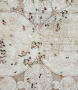
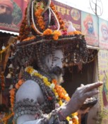
Amazing Places in the World: The Kumbh Mela
Grand Openings
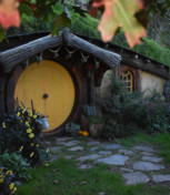
Walking New Zealand
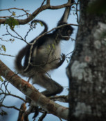
A Tale of Two Jungles
Not Just Another Day at the Beach
The Corn Tortilla: A Mexican Superhero
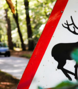
Oh, Deer! Road Signs in Different Cultures
Life Changes When A Brain Goes Bilingual
Same Animal + Different Cultures = Surprise!
Heading South to Ecuador And North on Life Goals
Cultural Heritage Below the Water Line
The Yin and Yang of Crossing Cultures
Teaching in Japan: A Cultural Encounter with Language