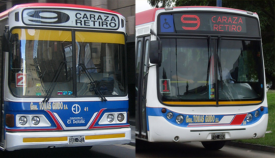
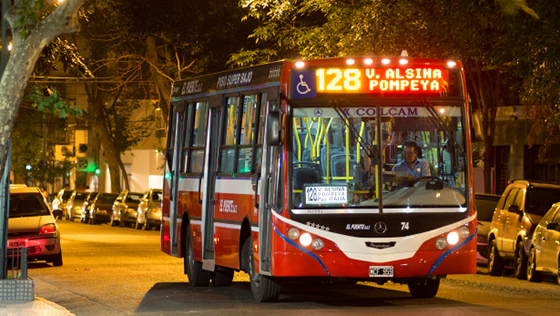
Buenos Aires buses dressed to the nines on their way from Caraza to Retiro, old style and new
© Bruce Goldstone
Buenos Aires buses dressed to the nines on their way from Caraza to Retiro, old style and new
© Bruce Goldstone
Buenos Aires is a city of kinetic visual overload, where color, pattern, and structure compete for your eye’s attention. One of the first things I fell in love here was the vintage fonts on the city buses. People tend to think I’m either kidding or crazy, but nonetheless, it’s true.
A source of constant design inspiration, the gorgeous graphics bundled onto a Buenos Aires bus pack a powerful punch.
Every bus line has its own vibrant palette, like rival schools sporting their colors. Strong stripes and elaborate, hand-painted designs called fileteado add to the impact.
And it’s all topped off with a big, bold number.
A Buenos Aires bus is a design class on wheels.
© Bruce Goldstone
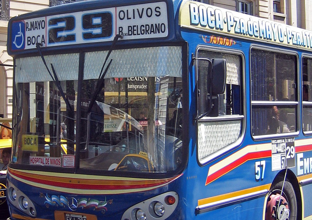
More than a hundred different bus lines cover the city in complicated routes that zig-zag through town. The number of the line perches proud and loud on the front of the bus.
Soon after I arrived, I began to snap photos of every bus that passed (while carefully avoiding being run over).
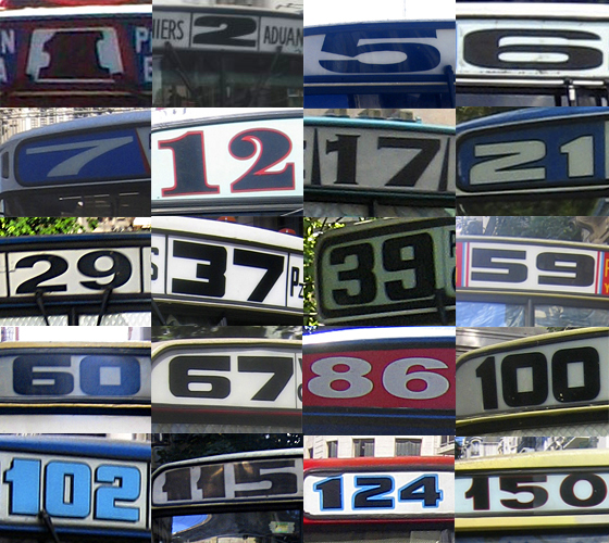
A number of bus numbers
© Bruce Goldstone
I took new delight in every bold or subtle variation, cruising the city’s streets:
So, the first time I saw a digital bus display in Buenos Aires, I was horrified.
Where’s the charm in a digital dot-matrix font?
© Bruce Goldstone
The modern clarity of the neon green digits struck me as inhuman and charmless. There was no style, no effort, and no class.
I sulked for days.
I groused to friends as more bus lines began to make the switch from hand-selected, quirky typography to mass-produced digital dullness.
But then one night, things got much clearer. Or, rather, they didn’t.
Several hours after 11:00 p.m. (when the subways shut down), I was dutifully waiting, and waiting, for a #29 bus. Early on in my Argentine education, I had learned that you have to flag down a bus if you want it to stop. If you don’t hail the driver, he won’t stop even if he sees you standing there.
Finally, I saw a bus in the distance. Alas, it was a #22, a line that would take me even farther from home.
So I didn’t signal the driver.
As the bus went by, I looked up again and realized I’d misread the barely-lit number. It was, in fact, my #29. I stuck my hand out, but—too late! The driver passed me by.
I had at least twenty minutes to think over my mistake, as well as my firm allegiance to dimly-lit vintage fonts of old. I began to rethink my aversion to digital fonts on electronic displays.
Now, whenever I see a night bus, I realize that its shining, vivid clarity has many virtues, not the least of which is visibility.
I’m beginning to see the charm here.
© holgs / iStock
And so I had an “Oh, I see” moment that was quite literally about seeing—It’s a whole lot easier to read electronic fonts at night.
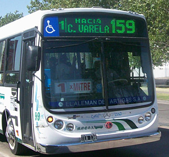
As I’ve come to terms with the new digital fonts, I’ve been heartened by another discovery. Not every bus line is content to stick with the simple, minimal dot-matrix fonts dictated by a small digital array. Newer models offer more complicated arrays that allow bus lines to choose their own, unique electronic fonts, like this elaborate #9.
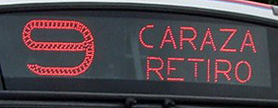
A nifty new nine
© Bruce Goldstone
I still love the vintage fonts that crisscross the city on many bus lines. They delight the eye as design inspiration for typography enthusiasts like me. But a bus passing in the night with its electronic display helped me get home, and that alone may be reason enough to accept the digital bus fonts that are taking over in Buenos Aires.
Comment on this post below, or inspire insight with your own OIC Moment here.
{"id":16767,"date":"2014-02-17T03:00:55","date_gmt":"2014-02-17T11:00:55","guid":{"rendered":"http:\/\/ohisee.genweb.site\/blog\/?p=16767"},"modified":"2021-07-20T07:52:24","modified_gmt":"2021-07-20T14:52:24","slug":"vintage-fonts-go-digital-on-buenos-aires-buses","status":"publish","type":"post","link":"https:\/\/www.oh-i-see.com\/blog\/vintage-fonts-go-digital-on-buenos-aires-buses\/","title":{"rendered":"Vintage Fonts Go Digital on Buenos Aires Buses"},"content":{"rendered":"
Buenos Aires buses dressed to the nines on their way from Caraza to Retiro, old style and new
\u00a9 Bruce Goldstone<\/p><\/div>\n
Buenos Aires is a city of kinetic visual overload, where color, pattern, and structure compete for your eye’s attention. One of the first things I fell in love here was the vintage fonts on the city buses.\u00a0People tend to think I’m either kidding or crazy, but nonetheless, it’s true.<\/span><\/p>\n A source of constant design inspiration, <\/span>the gorgeous graphics bundled onto a Buenos Aires bus pack a powerful punch.<\/p>\n Every bus line has its own vibrant palette, like rival schools sporting their colors. Strong stripes and elaborate, hand-painted designs called fileteado<\/em>\u00a0add to the impact.<\/p>\n And it’s all topped off with a big, bold number.<\/p>\n A Buenos Aires bus is a design class on wheels. More than a hundred different bus lines cover the city in complicated routes that zig-zag through town. The number of the line perches <\/span>proud and loud on the front of the bus.<\/p>\n Soon after I arrived, I began to snap photos of every bus that passed (while carefully avoiding being run over).<\/p>\n A number of bus numbers I took new delight in every bold or subtle variation,\u00a0cruising the city’s streets:<\/p>\n So, the first time I saw a digital bus display in Buenos Aires, I was horrified.<\/p>\n Where’s the charm in a digital dot-matrix font? The modern clarity of the neon green digits struck me as inhuman and charmless. There was no style, no effort, and no class.<\/p>\n I sulked for days.<\/p>\n I groused to friends as more bus lines began to make the switch from hand-selected, quirky typography to mass-produced digital dullness.<\/p>\n But then one night, things got much clearer. Or, rather, they didn’t.<\/p>\n Several hours after 11:00 p.m. (when the subways shut down),<\/span> I was dutifully waiting, and waiting, for a #29 bus. Early on in my Argentine education, I had learned that you have to flag down a bus if you want it to stop. If you don’t hail the driver, he won’t stop even if he sees you standing there.<\/p>\n Finally, I saw a bus in the distance. Alas, it was a #22, a line that would take me even farther from home.<\/p>\n So I didn’t signal the driver.<\/p>\n As the bus went by, I looked up again and realized I’d misread the barely-lit number. It was, in fact, my #29. I stuck my hand out, but—too late! The driver passed me by.\u00a0 I had at least twenty minutes to think over my mistake, as well as my firm allegiance to dimly-lit vintage fonts of old. I began to rethink my aversion to digital fonts on electronic displays.<\/p>\n Now, whenever I see a night bus, I realize that its shining, vivid clarity has many virtues, not the least of which is visibility.<\/p>\n I’m beginning to see the charm here. And so I had an\u00a0“Oh, I see” moment<\/strong> that was quite literally about seeing—It’s a whole lot easier to read <\/span>electronic fonts at night.<\/p>\n As I’ve come to terms with the new digital fonts, I’ve been heartened by another discovery. Not every bus line is content to stick with the simple, minimal dot-matrix fonts dictated by a small digital array. Newer models offer more complicated arrays that allow bus lines to choose their own, unique electronic fonts, like this elaborate #9.<\/p>\n A nifty new nine I still love the vintage fonts that crisscross the city on many bus lines. They delight the eye as design inspiration for typography enthusiasts like me. But a bus passing in the night with its electronic display helped me get home, and that alone may be reason enough to accept the digital bus\u00a0fonts that are taking over in Buenos Aires.\u00a0<\/span><\/p>\n Comment<\/i><\/a>\u00a0<\/em>on this post below, or inspire insight with your own\u00a0OIC Moment\u00a0<\/em>here<\/em><\/a>.<\/em><\/p>\n","protected":false},"excerpt":{"rendered":null,"protected":false},"author":9,"featured_media":16770,"comment_status":"closed","ping_status":"open","sticky":false,"template":"","format":"standard","meta":{"footnotes":""},"categories":[239,126],"tags":[],"class_list":["post-16767","post","type-post","status-publish","format-standard","has-post-thumbnail","hentry","category-argentina-mappoints","category-art-creative"],"aioseo_notices":[],"_links":{"self":[{"href":"https:\/\/www.oh-i-see.com\/blog\/wp-json\/wp\/v2\/posts\/16767","targetHints":{"allow":["GET"]}}],"collection":[{"href":"https:\/\/www.oh-i-see.com\/blog\/wp-json\/wp\/v2\/posts"}],"about":[{"href":"https:\/\/www.oh-i-see.com\/blog\/wp-json\/wp\/v2\/types\/post"}],"author":[{"embeddable":true,"href":"https:\/\/www.oh-i-see.com\/blog\/wp-json\/wp\/v2\/users\/9"}],"replies":[{"embeddable":true,"href":"https:\/\/www.oh-i-see.com\/blog\/wp-json\/wp\/v2\/comments?post=16767"}],"version-history":[{"count":1,"href":"https:\/\/www.oh-i-see.com\/blog\/wp-json\/wp\/v2\/posts\/16767\/revisions"}],"predecessor-version":[{"id":40688,"href":"https:\/\/www.oh-i-see.com\/blog\/wp-json\/wp\/v2\/posts\/16767\/revisions\/40688"}],"wp:featuredmedia":[{"embeddable":true,"href":"https:\/\/www.oh-i-see.com\/blog\/wp-json\/wp\/v2\/media\/16770"}],"wp:attachment":[{"href":"https:\/\/www.oh-i-see.com\/blog\/wp-json\/wp\/v2\/media?parent=16767"}],"wp:term":[{"taxonomy":"category","embeddable":true,"href":"https:\/\/www.oh-i-see.com\/blog\/wp-json\/wp\/v2\/categories?post=16767"},{"taxonomy":"post_tag","embeddable":true,"href":"https:\/\/www.oh-i-see.com\/blog\/wp-json\/wp\/v2\/tags?post=16767"}],"curies":[{"name":"wp","href":"https:\/\/api.w.org\/{rel}","templated":true}]}}
\u00a9 Bruce Goldstone<\/p><\/div>\nA Number Is Worth a Thousand Words<\/span><\/h4>\n
 <\/a>
<\/a>
\u00a9 Bruce Goldstone<\/p><\/div>\n\n
Zero Tolerance<\/h4>\n
\u00a9 Bruce Goldstone<\/p><\/div>\nThen Again . . .<\/h4>\n
\n<\/span><\/p>\nI Saw the Light<\/h4>\n
\u00a9 holgs \/ iStock<\/p><\/div>\n
\u00a9 Bruce Goldstone<\/p><\/div>\n